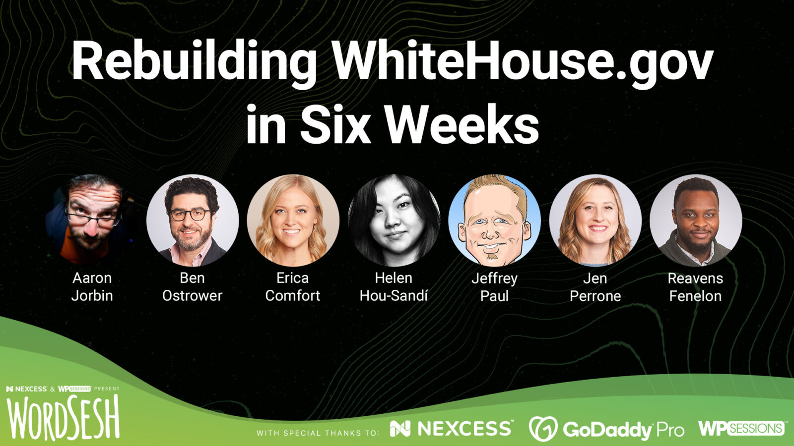
KEYNOTE: Rebuilding WhiteHouse.gov in Six Weeks
A case study more than a year in the making, this keynote follows seven team members, from different agencies, who were responsible for key aspects of rebuilding WhiteHouse.gov for the Biden-Harris administration.
Due to several unprecedented constraints, the team had a total of six weeks to design, develop, test, and launch the entire project ahead of an immovable deadline of 12:01 pm Eastern Time on Inauguration Day.
Despite the compressed timeline, the team sought to create an online home grounded in inclusivity, accessibility, performance, and security.
They prioritized WCAG 2.1 AA accessibility, carefully crafted custom toggles for contrast and enlarging tex, and partnered with technical specialists who are blind and visually impaired. Additionally, the team recruited translators who ensured every piece of content was thoughtfully translated into Spanish.
Under the hood, a highly customized Gutenberg editing experience was built on a flexible, user-centric publishing framework designed to adapt to the Administration as their digital communication needs grow and change.
And all of this is on top of an entirely new brand, design, and UX strategy – produced expressly for the new administration – to help govern the enormous number of decisions that had to be made quickly.
Come and learn how a cross-functional team from multiple different agencies pulled off the incredible!